Typography
We have.
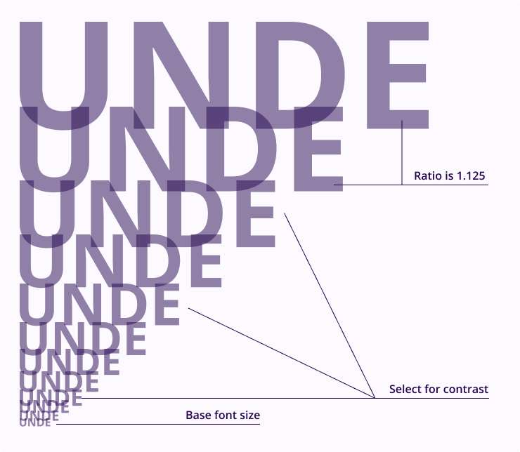
Scale
The typography stretches to all medium from digital to print. This requires flexibility so we use a ratio to dynamically define hierarchies.
Our ratio is the major second which is 1.125.

Use https://www.modularscale.com/ to generate hierarchy.
Our Typefaces
We use two typefaces Open Sans and Montserrat.
Display font
Display font is Montserrat Black used in all upper case. It is an aesthetic statement. It has wide glyphs with a lot of personality.

Use only for small and medium text as the top most level in the hierarchy.
Open Sans
Use weights and size to create contrast for each levels of hierarchy of information architecture.