Logo
The logo is the centerpiece of our visual identity. It anchors the brand. We established these guidelines to ensure a consistent application on all media.
Construction
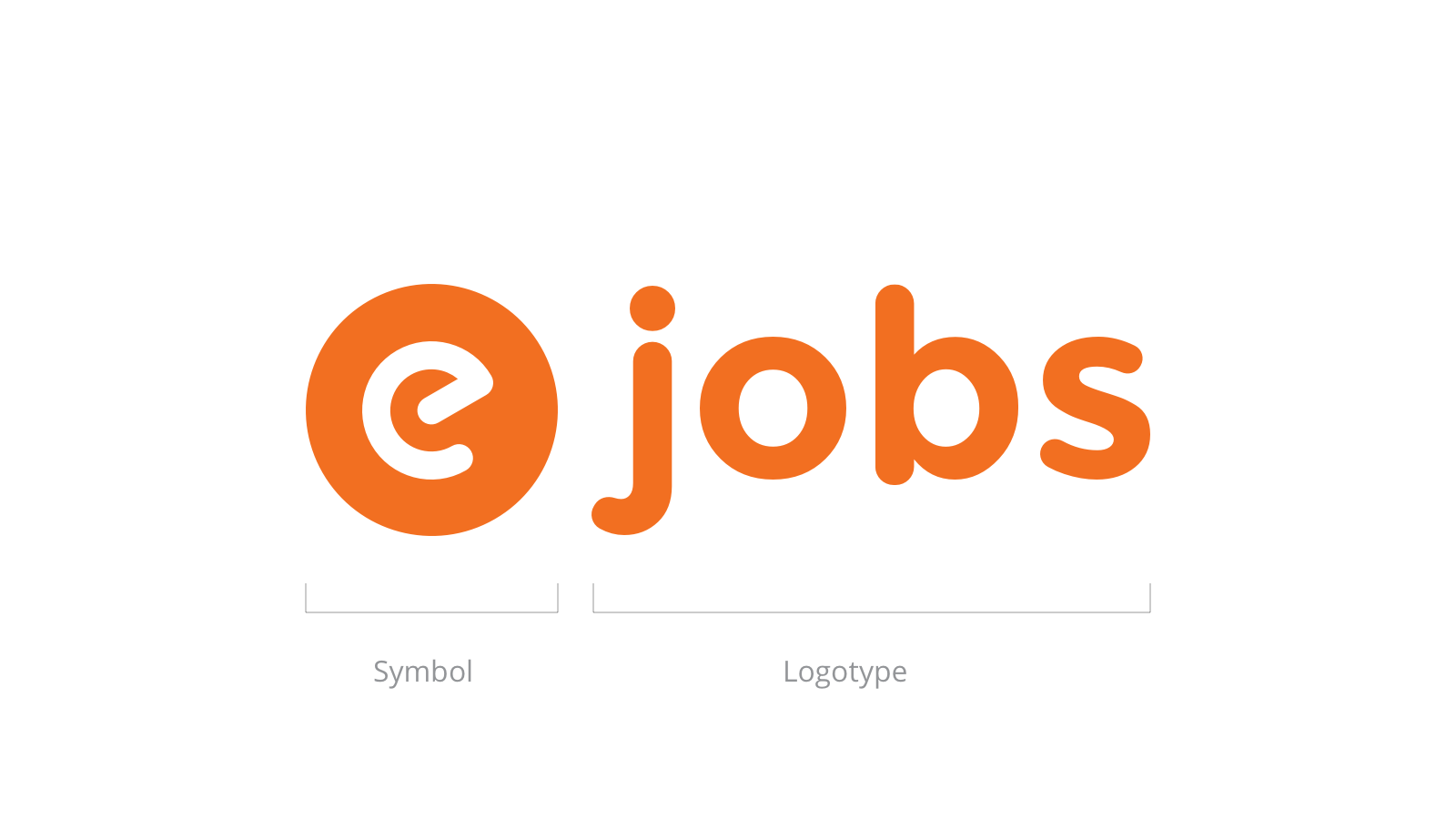
The logo consists two main elements: the symbol and the logotype. We aligned it horizontally. This is our primary lockup and it must be used whereas possible.
Proportions
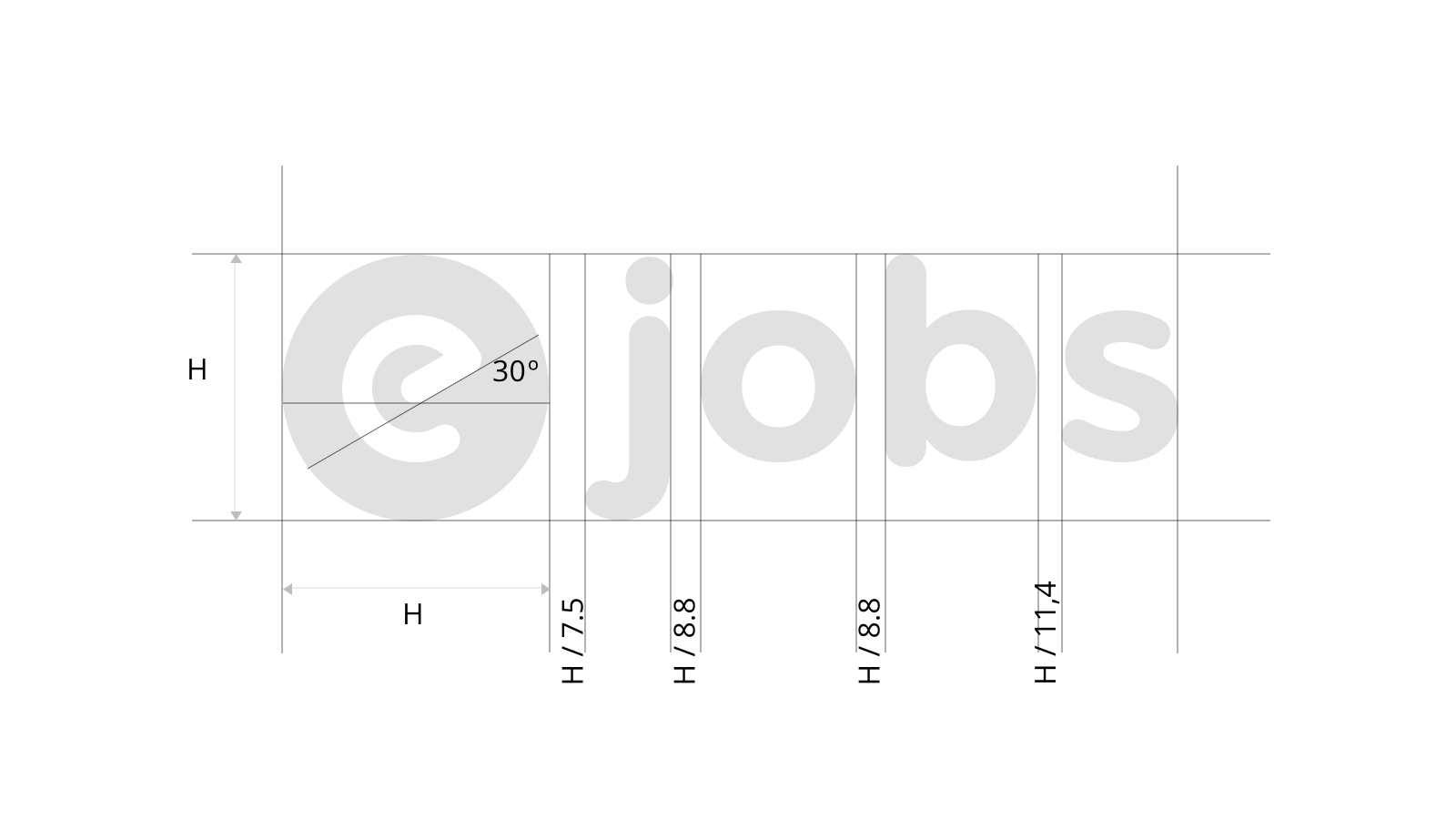
We use a ratio to define the dimensions and the structure of the lockup. This ratio assures replicability.
Note that the the letter spacing is derived from the height of the symbol.
Size
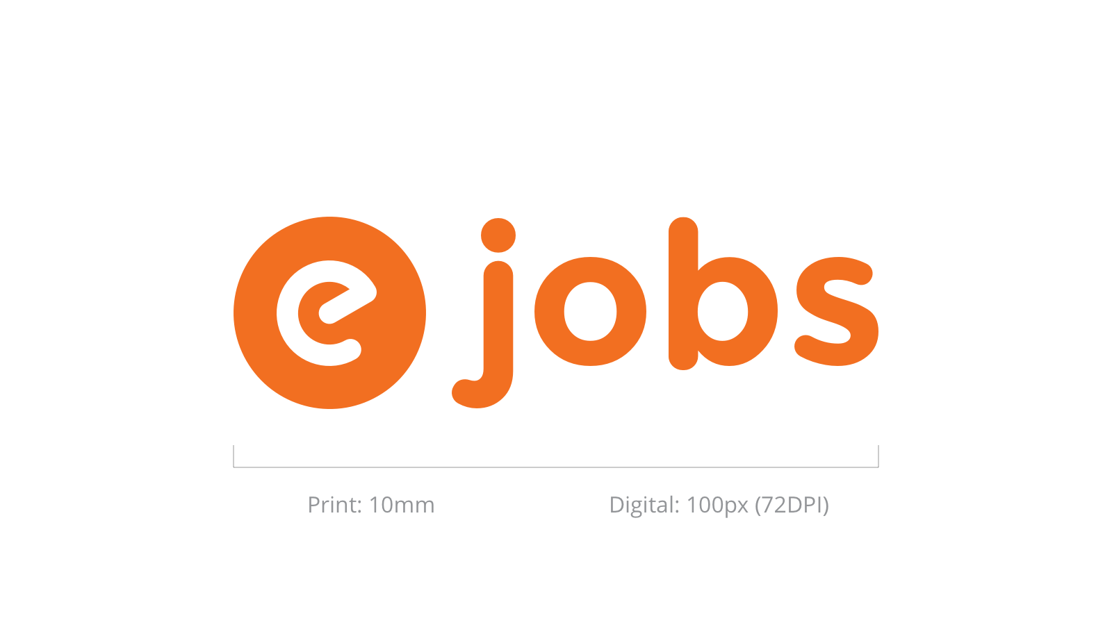
In order to secure an appropriate legibility we must never render the logo smaller than its minimum dimensions.
| Medium | Width |
|---|---|
| 10 mm | |
| Digital | 100px (72DPI) |
White Space
Our logo needs space to stand out to maximise impact. We have to keep this minimum distance around it according to the represented shape and dimensions.

Colors
We use the logo in solid brand colors: orange and purple.


Black and white
When polychromatic reproduction is not possible - because of technical or commercial reasons - we can use monochromatic version of the logo.


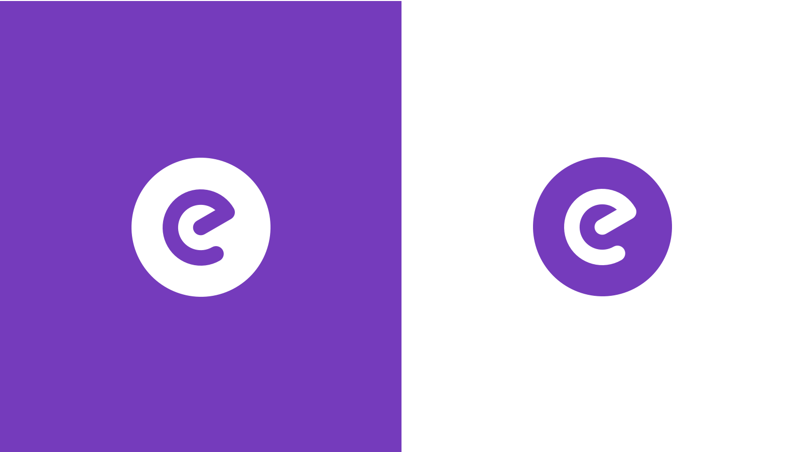
Variants
Some use cases requires that we use a different version of the logo to signal our presence. Use these logos only if the main lockup is not suitable.
As symbol
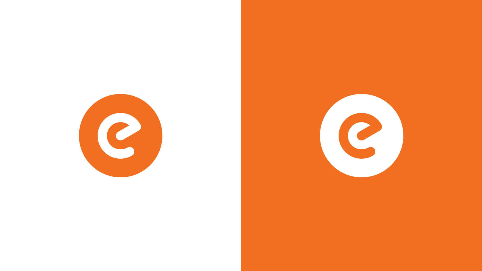
If space is limited we can reduce our logo to the symbol.
Common misuse
WARNING
Do not alter the structure
WARNING
Do not distort or squeeze
WARNING
Do not try to reproduce the logo
WARNING
Do not alter the logo in any way
WARNING
Do not recolor the logo